Max Strong
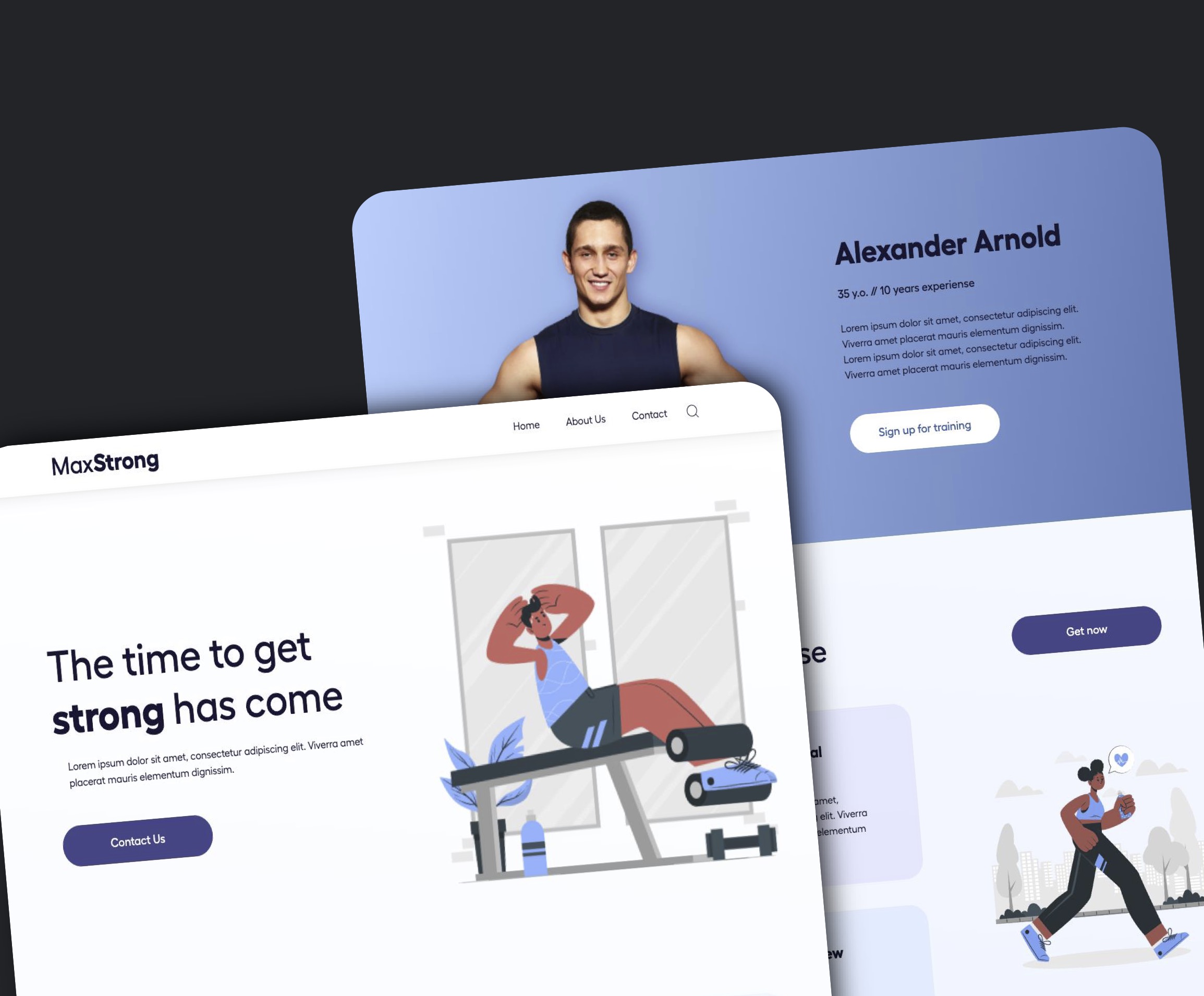
About the project
This was the first larger HTML & CSS project I did a while back. I learned a ton while doing it and I still use what I learned from this project on a daily basis. Here's a short list of some of the major takaways I got from this project.
- Use semantic HTML when possible. Turns out I had a bad habit of using generic HTML elements coupled with the use of classes and ID's to differentiate between them. I learned a valuable lesson regarding the use of the newer HTML5 elements to organize my code.
- Don't use containers unless you really need to. I went haywire with the addition of containers in this code originially because I was not able to plan out my page before I started writing the code. I wanted them there in case I needed them later; lots of times I didn't end up using them which resulted in superfluous code. I learned how to better plan my layout and only use containers where absolutely necessesary.
- Container names need to be clear that they are indeed containers. When coming across a time that is appropriate to use a container, the class or ID name needs to specify that. The lesson I learned here was that I may not be the only one who sees this code, and some thought should be given to the other programmer (or my future self) that my have to try and decipher my code.
- If we can avoid using position:absolute we should. While doing this project, I learned that there are only a few instances where using absolute posititioning is superior to another method. I now try to use a different method before attempting it with absolute positioning. This has resulted in more responsive and fluid website layouts.
- In general, adding fixed heights to elements removes flexibility in the site. In an attempt to get a "pixel perfect layout" on this project, I ended up adding fixed heights on certain elements to get them to be the exact size I wanted. I learned that doing that, while I may get what I want for that particular window width, it probably won't be as responsive as I want.
Conclusion
While this project isn't the largest one I've done, it was one of my firsts. The lessons I learned while completing it have served me well to this day.
